
Paolozzi Exhibition
A personal project (who doesn't love those!) inspired by an exhibition of Eduardo Paolozzi prints at the National Gallery of Scotland.
Beyond the beautiful colours and textures which Paolozzi was able to combine in his prints (and which I hope I've managed to somewhat emulate in After Effects), I was awed by the sense of movement he conveyed in much of his work.
For a breakdown of the process I adopted on this particular project, scroll below the video!
The process
Inspiration
The process of taking an existing static design and turning it into a beautiful, functioning piece of animation is a challenge I often come across as a motion designer.
Beginning the process with such great reference material like this is rare, but it only emphasises the importance creating style frames early on in the process.
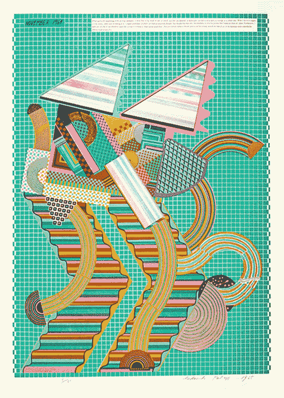
I looked at dozens of Paolozzi pieces, but fell for this piece in particular (Parrot, As Is When, 1964) because of it's variety of overlapping shapes, patterns and colours.
Composition & Flow
Where in the gallery, I was able to study this work for several minutes, here I needed to create a piece of animation which would allow audiences to experience the full piece in just a few short seconds.
I often experiment with layouts in quick sketches and draft rough storyboards to test the flow of a piece before I begin animation - and this project was no exception.

Individual Animations
I wanted each separate element to have it's own unique animation, while being subtle and similar enough in movement to lend a sense of continuity and connection between them.
I found Paolozzi's use of lines to be especially inspiring when deciding on each elements' animation - using these lines to emphasise and draw attention to their shape.
Texture & Polish
Inspired by the texture of the original print, I added some scratches and noise, roughened up the edge and varied the frame rates of various elements.
Though these are subtle imperfections, I believe they elevate the final piece so that it better captures the original work by Paolozzi.